Benedictional
F-moh3

General Information
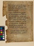
'Large caroline minuscule, rather of the type of the Benedictional of St Athelwold, but larger, and the g is different. 2-line red initials' (Ker, p. 340).
Large English caroline minuscule with wide forms and very few words per line. Space between words is substantial, although this contrasts with the frequent lack of space within words. The eye of e is rather high and narrow, and it often has a straight tongue, especially at word end; g has a long and open tail; s reaches below the baseline. No st-ligature. Irregular use of ligatured ae and e-caudata. Minims have no feet, although occasionally they may turn right at the end of a sequence (as in m). Ascenders are clubbed, whereas descenders are thin and straight. Rubrics are in red Uncial capitals, and are often found at line ends or even in the outer margin. Punctuation combines both punctus simplex and punctus elevatus.
Initials were added in the margins in red ink throughout, with chapter initials in a larger size (2-line height). Also, square capital D and uncial D alternate when found in close proximity.
Original Condition
Current Condition
Content
Bibliography
-
N.R. Ker, Medieval Manuscripts in British Libraries. Vol. 2 (Oxford: Clarendon, 1977), pp. 340-1.
